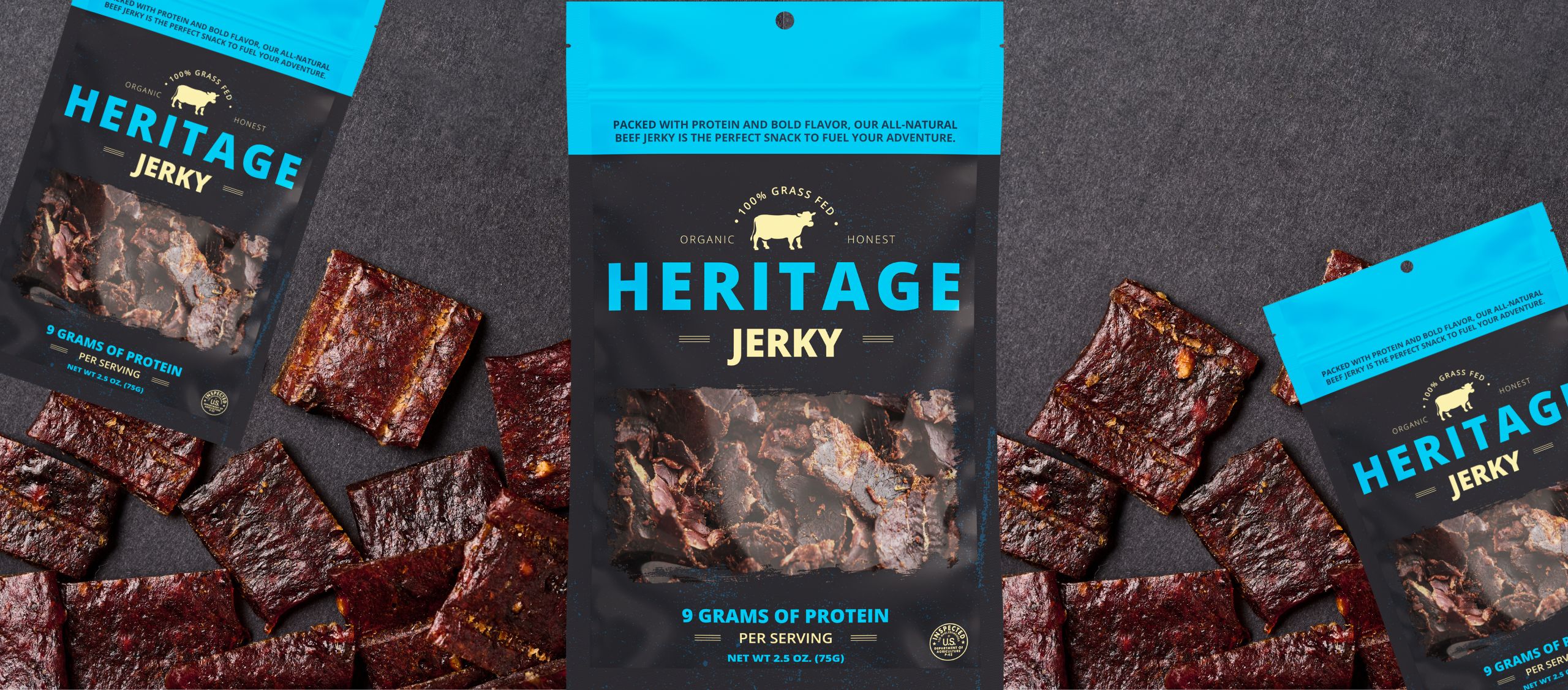
Pick up any two bags of jerky with roughly the same ingredients and price point: one looks like it belongs at a specialty grocer and the other looks like it belongs at a convenience store checkout. Yet the product inside might be identical. The difference is entirely in what the packaging communicates and most shoppers make that call in about two seconds.
If you’re building a jerky brand, that two-second impression is one of the most important decisions you’ll make. Your jerky packaging isn’t just protecting your product. It’s making a brand argument on your behalf before a single word gets read. Here’s what your packaging is actually saying and how to make sure it’s saying the right thing.
Two Seconds Is All You Get
Shopper decisions at shelves are faster and more instinctive than most brand builders realize. Packaging isn’t evaluated, it’s felt. A shopper walking down the snack aisle is processing dozens of competing products simultaneously, and their brain is making tier-level judgments (premium, everyday, value) almost instantly. In fact, data shows it takes your buyer anywhere from 2-7 seconds for a customer to decide if they want to purchase your product or not. That means every element of your packaging such as format, finish, color, and structure is communicating something, whether you intended it or not.
The question isn’t whether your packaging sends a signal. It’s whether that signal matches the brand you’re actually building.
What Your Format Is Already Saying
Format choice, including stand-up pouch, flat pouch, or flat-bottom pouch communicates product positioning and use occasion before a shopper reads any text. Consider what each format signals at a glance:
- A custom stand-up pouch with a wide front panel says: I belong here, this brand has invested in how it shows up.
- A slim lay-flat pouch in a clip strip says: grab me on the go, I’m convenient and approachable.
The point isn’t that one format is better than another. It’s that each one makes a claim, and that claim should be intentional. A format chosen purely for production convenience, without considering what it communicates, is a missed opportunity to tell your brand story before the shopper even picks up the bag.
Finish Is the Tone of Voice Your Packaging Uses
If format is your packaging’s body language, finish is its tone of voice. And this is where a lot of jerky brands leave meaning on the table.
The right finish should match the conversation your brand is trying to have with a shopper. The finish that works for a bold, high-protein performance brand might be different for a craft, small-batch snack brand. That’s a conversation worth having before you go to production with your packaging partner.
The same logic applies to color. Deep, saturated colors with metallic accents read differently than earthy, muted tones with natural textures. Neither is wrong. Both are saying something specific about who made this product and who it’s for.
When Your Packaging and Your Brand Are Telling Different Stories
Here’s the tension that doesn’t get talked about enough: a great product in underwhelming packaging loses the sale to a lesser product in more confident packaging. That’s not a harsh judgment, it’s how shelf evaluation works.
The mismatch problem is real, and it’s worth diagnosing honestly. Ask yourself:
- Does my packaging finish match the price point I’m charging?
- Does my format match where and how my customer is buying – convenience, specialty, online?
- If someone picked up my bag, would the feel of it reinforce or undermine what the label says about my brand?
- Does my packaging look like it belongs in the same retail environment as my target competitors?
If any of those answers give you pause, the gap is worth closing and it’s often more approachable than you’d expect.
Consistency Across SKUs Is a Brand Signal Too
For brands with multiple flavors or formats, inconsistency across the line quietly undermines brand equity in a way that’s easy to miss from the inside: different finishes across SKUs, color accuracy that drifts run to run or even pressure-sensitive labels on secondary packaging that don’t match the graphics on your flexible pouches.
Shoppers experience your brand as a family. If the original flavor looks premium and the Peppered feels like a different product, you’ve lost the brand coherence that builds recognition and loyalty over time.
Working with a single packaging partner who can manage your flexible packaging and pressure sensitive labels together (i.e. matching finishes, color standards, and graphic specifications across formats) is a meaningful brand consistency advantage. It’s one of the clearest ways a partner relationship translates into shelf performance.
Figure Out What You Want to Say, Then Build the Packaging Around That
The brands that make the strongest packaging decisions don’t start with specs. They start with the question: what do I want a shopper to experience our brand and product? From there, format, finish, structure, and material choices all have a clear brief to work from. That’s where a good packaging conversation begins.
Belmark’s packaging experts work through that brand story with you before the conversation ever gets to materials or format. A jerky brand that starts with clarity on what it wants to say makes better packaging decisions at every scale, from one SKU to a full line.
FAQs About Jerky Packaging
Ready to close the gap between the brand you’re building and the packaging that represents it? Talk to a packaging expert.
Share This Story, Choose Your Platform!
Ready to get started?
Ready to get started?
Call 920.280.1282 or fill out this form and you’ll be in touch with a packaging expert in under 24 hours.
Call 920.280.1282 or fill out this form and you’ll be in touch with a packaging expert in under 24 hours.