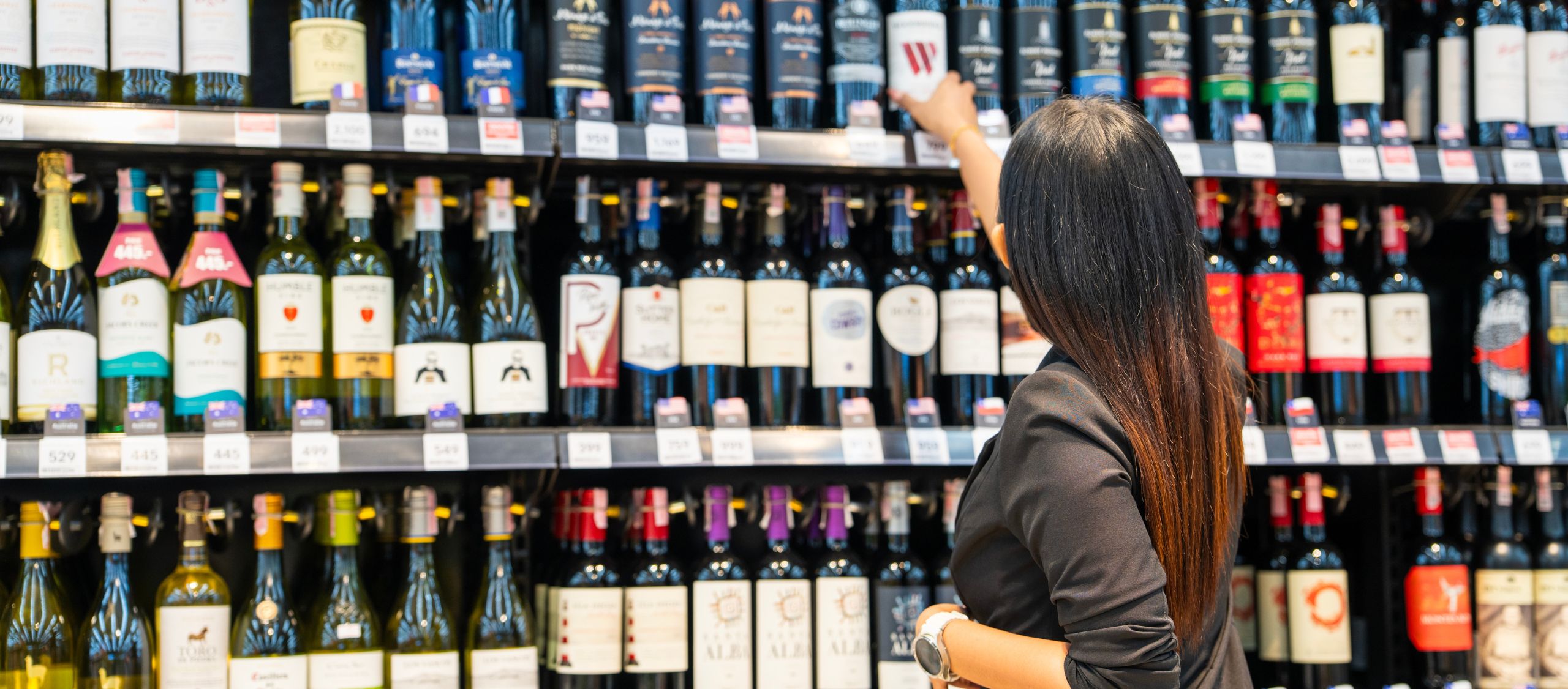
The wine labels winning right now share something in common: they’re not just designed well, they’re produced in a way that makes the trend actually executable.
Whether you’re approaching a new vintage, a seasonal release, or a full label refresh, here’s what’s moving in wine packaging and how to make sure you can actually pull it off.
Why Your Label Has More to Do Now Than It Used To
Wine shoppers come in two modes: the one who knows exactly what they’re reaching for, and the one who’s browsing. In both cases, your label is working hard. It has to signal quality at a glance, communicate your brand story in a few seconds, meet compliance requirements, and still look like it belongs on the shelf next to labels that may have significantly larger production budgets.
What that label needs to do also varies by where you are in your brand journey. A first vintage has different priorities than a SKU refresh for regional retail. A limited-edition seasonal label has different constraints than a core lineup label that needs to look consistent across a thousand cases.
The good news: there are more tools available now to help wine brands execute at a high level, regardless of run size. The trends below aren’t just design inspiration. They’re options that are genuinely accessible when you’re working with the right label partner.
Premium Finishes: What’s Actually Worth It
Premium finishes are having a moment in wine packaging, and for good reason. Products with premium label materials are more likely to be purchased 80% of the time. Pretty significant right? The right finish doesn’t just look elevated, it changes how a shopper physically experiences the bottle before they even read a word on the label.
A few finishes that are gaining traction right now:
- Tactile varnish and soft-touch laminates. The sensation of running a finger across a soft-matte label signals quality before the brain catches up with the eyes. It’s subtle, but it shifts perception immediately.
- Hot stamping and foiling. Gold and silver foil have deep roots in wine packaging, but the application is evolving: fine-line foil details, tonal metallic effects, and foil on dark substrates are all generating strong shelf presence without feeling dated.
- Specialty laminates and pattern finishes. Linen textures, pattern varnishes, and dimensional embossing are giving wine labels a tactile dimension that digital printing alone can’t replicate.
- Spot gloss on matte. Contrast between matte and gloss surfaces draws the eye to specific design elements such as a vineyard name, a vintage year or a logo. You can create a visual hierarchy without adding color.
The right finish depends on the look and feel you’re going for, and honestly, that’s a conversation, not a spec sheet. What reads as “premium” for a natural wine is different from what reads as premium for a structured Napa Cabernet. A packaging partner who understands both the production side and the brand intent helps you get there faster.
Minimalism and Storytelling: Two Trends Pulling in Opposite Directions
The wine label market is moving in two directions simultaneously, and both are working.
On one end: stripped-down, white-space-heavy labels that let the varietal and the producer name do all the work. Clean typography, limited color, no clutter. This aesthetic reads as confident: a brand that doesn’t need to explain itself. It’s particularly strong for brands positioning around approachability and everyday drinking occasions.
On the other end: rich, illustrated labels with heritage cues, hand-drawn vineyards, estate maps, botanical details, and narrative vignettes. These labels reward a closer look and invite a story. They tend to work well for brands with a strong sense of place or provenance, and for premium bottles where the shopper is already inclined to linger.
One isn’t better than the other. Yet, neither works if it’s disconnected from the brand’s actual story and audience. A sparse minimalist label on a full-bodied heritage red can feel off. An elaborate illustrated label on a fresh, easy-drinking rosé can feel like too much.
The brands executing most effectively right now have made a clear choice and committed to it. The label feels like a natural extension of the wine portfolio, not a design trend applied from the outside.
Sustainability on the Label: Honest Options, No Trade-Offs
Sustainability in wine packaging is a genuine consumer expectation at this point, not a niche preference. And the good news for wine brands is that sustainable label options have advanced significantly. The trade-off between eco-friendly materials and visual quality is largely a concern of the past.
Belmark’s tru-IMPACT® and eco-READY™ programs are built specifically for this. tru-IMPACT® addresses the environmental footprint of label production in a transparent, measurable way. eco-READY™ covers material options, such as recycled content and recyclable films that meet real sustainability goals without requiring any visual compromise.
The right sustainable option depends on your substrate, your finish, your production line, and what sustainability claims you want to be able to make. That’s a conversation worth having before artwork goes to press.
Short Runs and Seasonal Releases: Trends You Can Actually Act On
One of the most practical shifts in wine label production is the ability to execute on trends, including premium finishes and sustainable materials, without committing to a massive order.
Seasonal releases, limited batches, and new varietal launches all share the same tension: you want a distinctive label that reflects the moment, but you don’t want to over-order and sit on inventory when the season passes or the vintage sells through. That tension used to mean accepting a more generic label to avoid the risk. It doesn’t anymore.
Digital printing has changed the short-run equation. Premium finishes, specialty substrates, and sustainable materials are all available at run sizes that match the actual needs of a seasonal label or a limited release. You’re not choosing between a label that looks right and a label that makes business sense – you can have both.
Speed-to-market matters here too. New vintages and seasonal windows don’t wait. A label partner with fast, reliable lead times and a structured process from artwork through production means you’re not scrambling at the end of an already tight timeline.
This is also where a strong partner relationship compounds. When your label partner already knows your brand, your substrate preferences, and your compliance requirements, a seasonal label doesn’t start from scratch – it builds on a foundation.
FAQs: Wine Label Trends
Choosing a Trend Worth Printing
Not every trend is right for every brand. The wine labels generating the most attention right now aren’t chasing everything at once, they’ve made a considered choice about what their label needs to do, and they’ve executed it well. The best packaging decisions come from a conversation about the product, the audience, and the timeline, not from a list of trends applied in isolation. Whether you’re approaching a new vintage, testing a seasonal label, or rethinking your core lineup, the details that make a label work are worth getting right the first time.
Ready to figure out which direction makes sense for your next label? Talk to a packaging expert and let’s look at what’s actually possible.
Share This Story, Choose Your Platform!
Ready to get started?
Ready to get started?
Call 920.280.1282 or fill out this form and you’ll be in touch with a packaging expert in under 24 hours.
Call 920.280.1282 or fill out this form and you’ll be in touch with a packaging expert in under 24 hours.