Consumers don’t pick up a nutraceutical product and immediately trust what’s inside. They evaluate the packaging first.
A clean label, a premium finish, a well-structured carton: these are the signals that tell a shopper, before they read a single ingredient, whether your product deserves a spot in their daily routine.
In the nutraceutical space, that first impression carries enormous weight. The global wellness industry reached a peak of $6.8 trillion in 2025 according to The Global Wellness Institute, and continues to expand. Shelves are filling up with new supplements, protein powders, and functional health products every season. Standing out isn’t just about having a great product – it’s about packaging that earns trust before anyone opens the lid.
Trust Is the Product Before the Product
Think about how a wellness shopper approaches a new brand. They scan the shelf, and something catches their eye. They reach for it. In that moment, the nutraceutical packaging is doing the selling. Shoppers look for visual cues that signal legitimacy: sharp color consistency, intentional typography, quality materials, and finishes that feel premium in the hand. A soft-touch coating on a folding carton tells a consumer this brand takes itself seriously. A label that looks slightly off-register communicates the opposite, even if the product inside is exceptional.
This is especially true for small businesses and growing nutraceutical brands competing against established names. The good news? Packaging that projects credibility and authority is well within reach. The key is knowing what elements drive consumer confidence and working with a partner who can deliver them consistently.
What Premium Nutraceutical Packaging Actually Looks Like
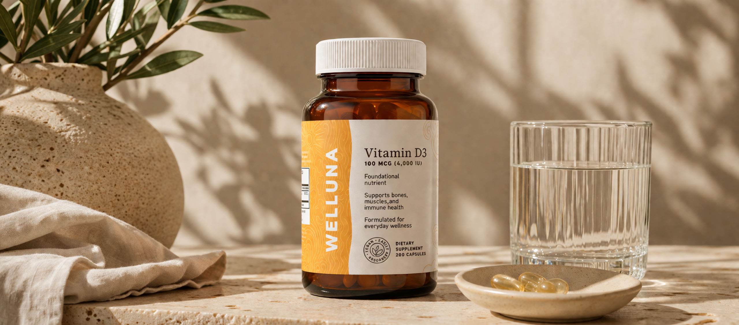
Premium doesn’t mean flashy. In nutraceuticals, premium means intentional. It means every element of your packaging works together to communicate quality – from the structure of a folding carton to the finish on a pressure sensitive label.
Some of the most effective packaging features for nutraceutical brands include:
- Tactile finishes: Matte, soft-touch, and dual finishes create a sensory experience that reinforces quality. A supplement that feels luxurious to hold becomes part of a ritual – not just a product.
- Metalized features: Metalized materials or foils add a premium, eye-catching element that elevates brand messaging and draws attention on crowded shelves.
- Embossing and raised elements: Texture creates a distinctive, memorable interaction. Raised logos or design elements signal craftsmanship.
- Precision color matching: Consistent, vibrant color builds brand recognition and credibility. When your label, carton, and pouch all align perfectly, your brand looks established – even if you just launched.
There’s no “one-size-fits-all” approach here. The right combination of these features depends entirely on your product, your market positioning, and your packaging format.
Label Clarity and the Consumer’s Daily Ritual
For many nutraceutical consumers, taking a supplement or protein shake is part of a daily ritual. That habit creates an ongoing relationship with your packaging – one that can either reinforce loyalty or erode it over time.
Label clarity is a critical piece of that relationship. Extended content labels allow brands to include detailed ingredient breakdowns, usage instructions, and even brand story content without cluttering the primary face panel. Folding cartons provide even more real estate – multiple panels that can carry benefits, QR codes, certifications, and brand values alongside the required regulatory content.
Scaling Without Losing the Brand Experience You’ve Built
One of the most common pitfalls growing nutraceutical brands encounter is what might be called “brand drift” – the gradual inconsistency that creeps in when packaging components are sourced from different vendors.
The bottle label looks slightly different from the carton. The signature color shifts between reorders. The folding carton and flexible pouch don’t feel like they belong to the same family. To a consumer, these small inconsistencies add up. They undermine the premium experience the brand has worked hard to build.
The solution is a unified packaging strategy – sourcing pressure sensitive labels, flexible packaging, and folding cartons from a single partner who manages color consistency across all formats. When everything runs through the same color management system, the brand stays coherent no matter the format or the quantity.
Sustainability as a Baseline, Not a Bonus
For nutraceutical brands, sustainable packaging isn’t a trend to chase – it’s an expectation to meet. Recyclable films, PCR content, and material reduction strategies can all work within a premium packaging design.
The key is working with a packaging partner who is transparent about what’s genuinely achievable and can guide you toward solutions that align with your brand values – without overpromising or greenwashing.
FAQs About Nutraceutical Packaging
Your Packaging Should Work as Hard as Your Product Does
The nutraceutical market rewards brands that get the full picture right – not just formulation, but presentation. Your packaging is the first thing a consumer evaluates, the thing they interact with daily, and one of the most powerful signals of quality and legitimacy you have.
The right nutraceutical packaging doesn’t just protect your product. It earns trust before anyone opens the product, tells your brand story in every touchpoint, and scales with you as your business grows.
Ready to talk through your packaging options? Belmark’s team is here to help – from first concept to full-scale production. Let’s talk about what’s possible.
Share This Story, Choose Your Platform!
Ready to get started?
Ready to get started?
Call 920.280.1282 or fill out this form and you’ll be in touch with a packaging expert in under 24 hours.
Call 920.280.1282 or fill out this form and you’ll be in touch with a packaging expert in under 24 hours.
